
Website Redesign Project
EMPATHIZE
User Research and User Interface Analysis
Our group, as a case study of government website efficiency, did the following analysis of the Department of the Interior Website, including a heuristic analysis of the site structure and home page, user persona, usability testing plan, affinity diagram and a feature prioritization matrix.
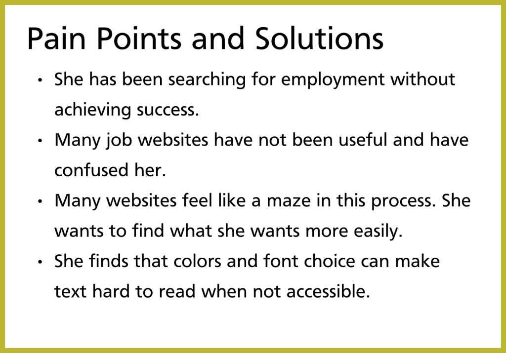
Proto Persona
Our group had difficulty figuring out who the main users of the website would be. We settled on someone looking for a job in a field similar to those that the the department of the interior hires into. As you can see below, Maria Hernandez is a Veteran looking for work now that she has finished her tour of duty.


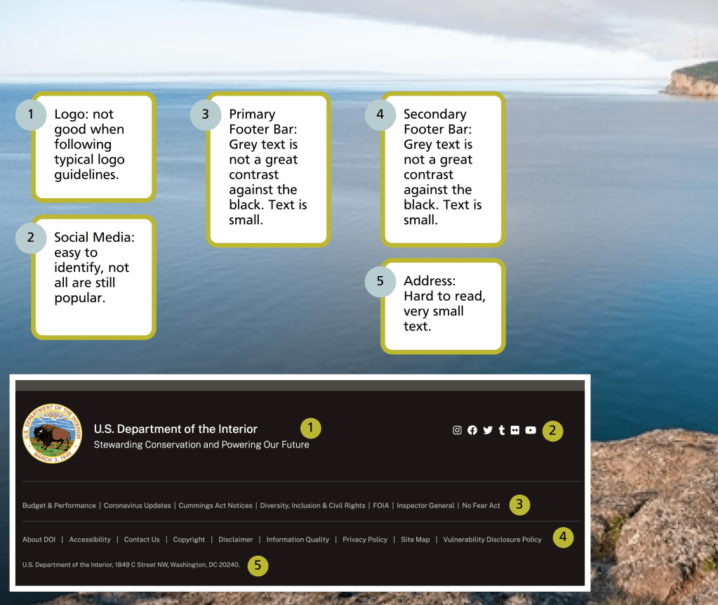
Heuristic Analysis of the Homepage and Navigation


Usability Testing Plan
We want the users of the Department of the Interior website to be able to find the information they need easily and for these users to be able to understand when they are clicking a link for an external site.
We also aim to learn more about how our users would use this site.
We picked 4 tasks for our testers to complete:
Find the Mission Statement of the DOI
Who is in charge of the DOI?
What are some news stories about what the DOI is currently doing?
Find out about jobs at the DOI for Veterans
Accessibility Testing was done on the colors and fonts on the original website, and the majority of the website passed, but the bright green buttons did not pass visibility standards.
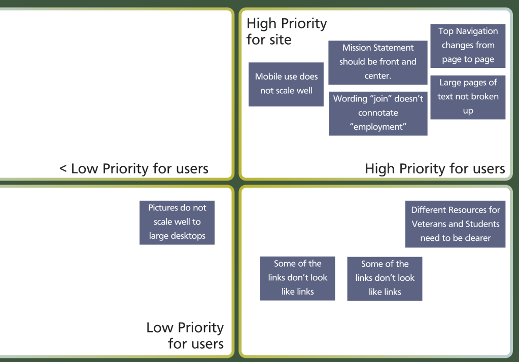
Feature Prioritization Matrix
From User Testing we developed the results into a feature prioritization matrix.
Guerrilla User Test Results
– Many pages go off of the main site without a good indication that you are leaving.
– The majority of the main navigation is easy to use
– The home page could make better use of the space above the fold
– Wording of copy on website could be clearer and more concise in many areas.
Navigation Bar Usability Test Plan
We want the users of the Department of the Interior website to be able to find the information they need easily on the navigation bar as they move from one task to the next.
We picked 4 tasks for our testers to complete.
History of the Interior
Pathway Program
Volunteer
Blog
Findings:
While conducting the user tests, we found that the Department of the Interior’s navigation bar is mostly user friendly.
The main pain points we found were:
returning to “home” after users clicked on the “Pathway Program” was difficult because the navigation bar changes
Many things in the footer need to be accessible in the top navigation
List of Bureaus and Offices is very long
Links in the “Join” page navigation bar is also different from main navigation bar.
IDEATE & DEFINE
Card Sorting and Initial Site Map Sort
During our card sorting exercise, we found that the majority of the items in the navigation were able to remain where they were. We ended up moving the “priorities” off of the main navigation and into the “about” category of the navigation. Many of the items in the footer did not make sense to be in the footer, so we nested those into the main header categories where they made sense. An example of this is moving the information about freedom of information act disclosures into the “newsroom” category.
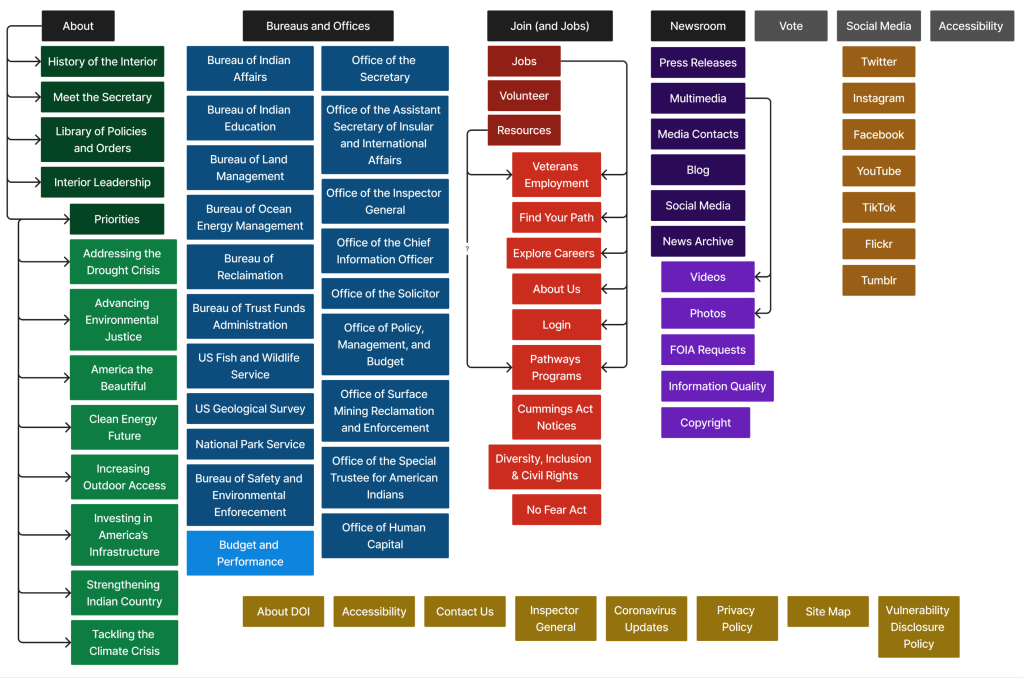
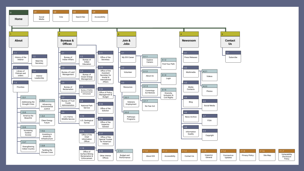
Site Map
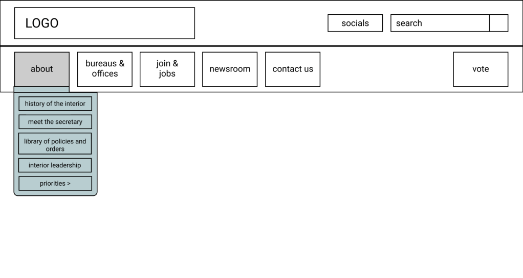
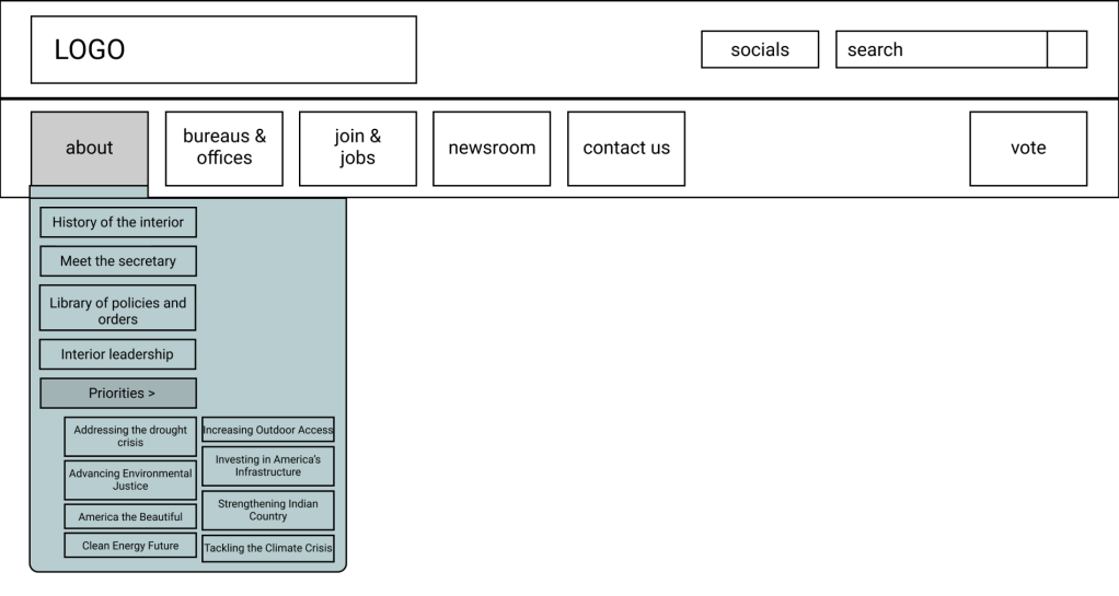
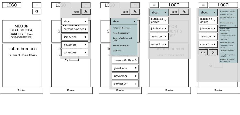
Lo-Fi Wireframe of Top Navigation

Current Mission Statement
The U.S. Department of the Interior protects and manages the Nation’s natural resources and cultural heritage; provides scientific and other information about those resources; and honors its trust responsibilities or special commitments to American Indians, Alaska Natives, and affiliated Island Communities.
Future UI Goals
– Better usability so that those that access the site have an easier time finding the information.
– Better accessibility for all users.
– More content chunking so content is less overwhelming.
– Consistent branding throughout.
– Simpler navigation.
Brand Positioning Statement
The Department of the Interior Website helps the DOI accomplish the goal of managing the Nation’s natural resources and cultural heritage by providing accessible navigation and less overwhelming content to help the average American feel at ease using the site to understand how the DOI is accomplishing its mission.
UI Style Guide
UI Style Direction
The Department of the Interior Website helps the DOI accomplish the goal of managing the Nation’s natural resources and cultural heritage by providing accessible navigation and less overwhelming content to help the average American feel at ease using the site to understand how the DOI is accomplishing its mission. We want the design to evoke the following adjectives:
Clean
Professional
Native
Natural
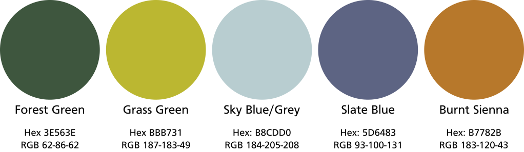
Colors
Typography

We want the typography to be professional, clean, and evocative of the typical signage we see around our countries beautiful national parks. The two typefaces we picked are Playfair Display font in both Regular, and SC styles and Frutiger typeface which is one of the official typefaces of the National Park Service. (Sizes for Desktop)
New Logo for the Department of the Interior
Eagle/Thunderbird
Eagles and Large Birds are used in most Native American Cultures to represent different things, but many times to represent wisdom and learning. Taking care of native peoples is an important job of the Department of the Interior.
Mountains/Hills/Forest
This symbol represents the Bureau of Land Management, US Geological Survey and the office of Surface Mining as well as the National Park Service.
Ocean/Body of Water
This is symbolic of the US Fish and Wildlife service as well as the Ocean Energy
Wind Power
This is symbolic of the US Fish and Wildlife service as well as the Ocean Energy
American Bison
PROTOTYPES & TESTING
Mobile Website Wireframe
Two different options for a hamburger menu style were explored
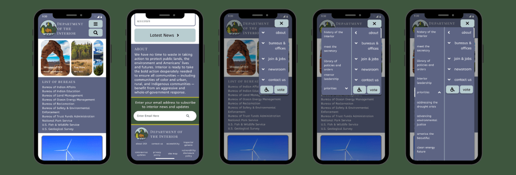
Mobile Prototype of Website Navigation
Mobile Navigation Bar
Usability Test Plan
We want the users of the Department of the Interior mobile website to be able to find the information they need easily on the navigation bar as they move from one part of the website to the next.
We picked 4 tasks for our testers to complete.
- Locate the Priorities of the DOI
- Subscribe to the newsletter
- Find the National Park Service Link
- and Find the News Archive
Findings:
While conducting the user tests, we found that our mobile navigation bar was mostly user friendly other than a few bugs that were found in the testing round and a few things our testers thought could change for the better.
The main pain points we found were:
- When one of the main areas was open, you could not switch between those areas and another main area without a bug happening
- Scrolling in the navigation bar is not something the testers liked and the list of Bureaus and Offices is very long
- Did not expect Subscribe to be under Contact Us in the top navigation
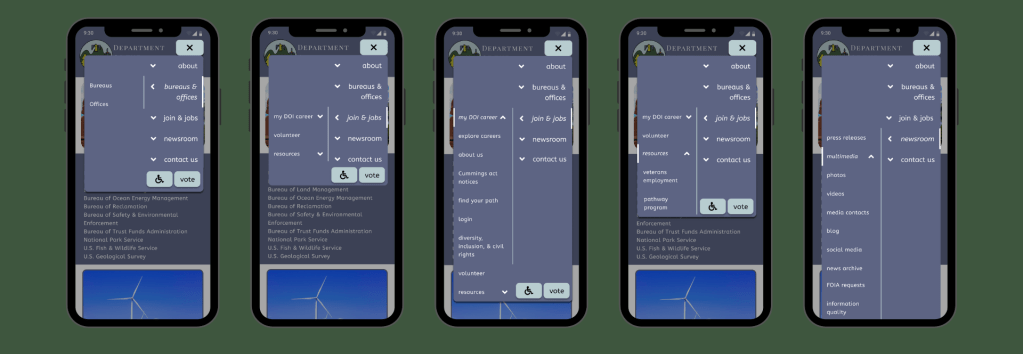
Hi-Fi Prototype of Mobile Top Navigation
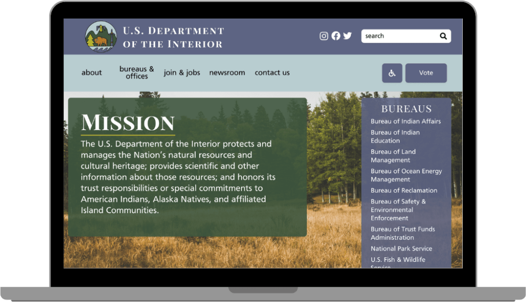
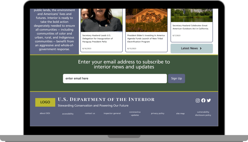
Desktop Header
Desktop Footer
Figma Desktop Prototype HERE
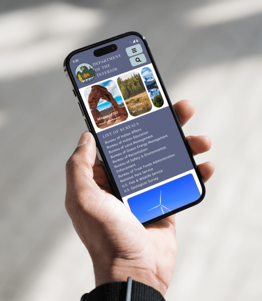
Hi-Fi Prototype of Mobile Top Navigation
Figma Mobile Prototype HERE
RESOURCES
Unsplash – Many Photos (more than listed)
Photo by Jake Weirick on Unsplash
Photo by Kait Herzog on Unsplash
Logo Usage Guidelines at the DOI: https://www.doi.gov/sites/doi.gov/files/elips/documents/386-dm-3-web-handbook-rev-1-april-2007-2-1.pdf
Figma File for Icons: https://www.figma.com/community/file/942053544758339202
Figma File for Icons 2: https://www.figma.com/community/file/886554014393250663/Free-Icon-Pack-1600%2B-icons
Canva: HERE
UX/UI Designers: Ciana Froemming, Emma Duda, Maneli Aygani, and Danielle Clifford
Tools Used: Figma, Canva, Google Drive, Slack, Figjam, Pinterest, Procreate
Contact Me
Danielle Clifford
danielleeclifford@gmail.com
612-599-2319
