
What was the idea behind the website redesign for Gifts for Seniors?
Our group of five designers all brain stormed together different local and national non-profits we have all interacted with and after looking at the different websites we decided that Gifts for Seniors was the non-profit that needed a site redesign most. As you will see below, we decided to update everything from their main navigation and site map to their logo and some of their color palette.
EMPATHIZE
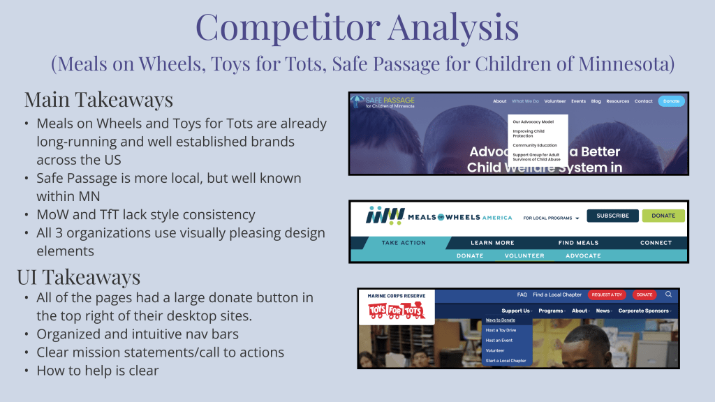
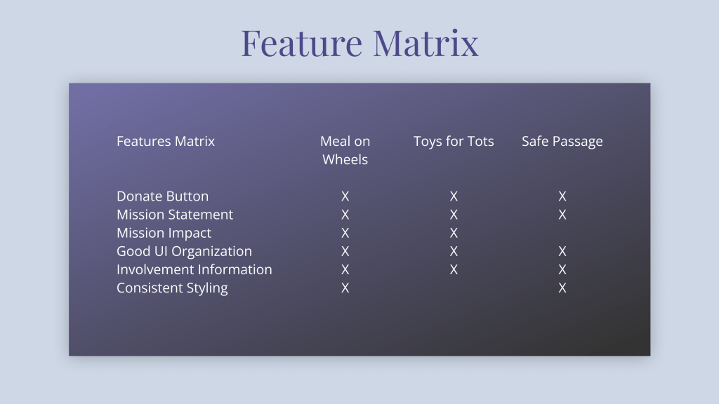
User Research and User Interface Analysis

Original Homepage Heuristic Annotations
- Logo: Limited Changes
- Nav Bar(s): Top nav bar is overshadowed by row of buttons below- Row of buttons is not only inconsistent, but also not very helpful
- Hero Image: Low quality and odd aspect ratio
- Call to Action: Effective but space/copy could be better
- Testimonials: Personal insights from previous volunteers – could be beneficial to new-comers
User Interview Plan
Research Goal
In order to develop a website that aids in helping this non-profit do more of their great work in our community, we need to discover what is and isn’t working for users. Whether it’s volunteers, donors, or seniors using their services, we aim to understand what pain points they may run into when interacting with the UI.
Research Questions
- What do supporters look for when researching nonprofits to support?
- What prompts people to support certain causes over others?
- Why do supporters spend their time volunteering for the organizations they volunteer for?
Methodology
User Interviews will be conducted to collect qualitative data from participants who volunteer frequently. A survey will also be conducted that will be dispersed throughout social media platforms to provide quantitative data.
Participants
The ideal participants will be volunteers and/or those who support local nonprofits frequently. Participants can be from any demographic and age group. Participants will help us understand the frustrations they may encounter with how they currently go about finding where and how to give back to their communities.
Survey Results
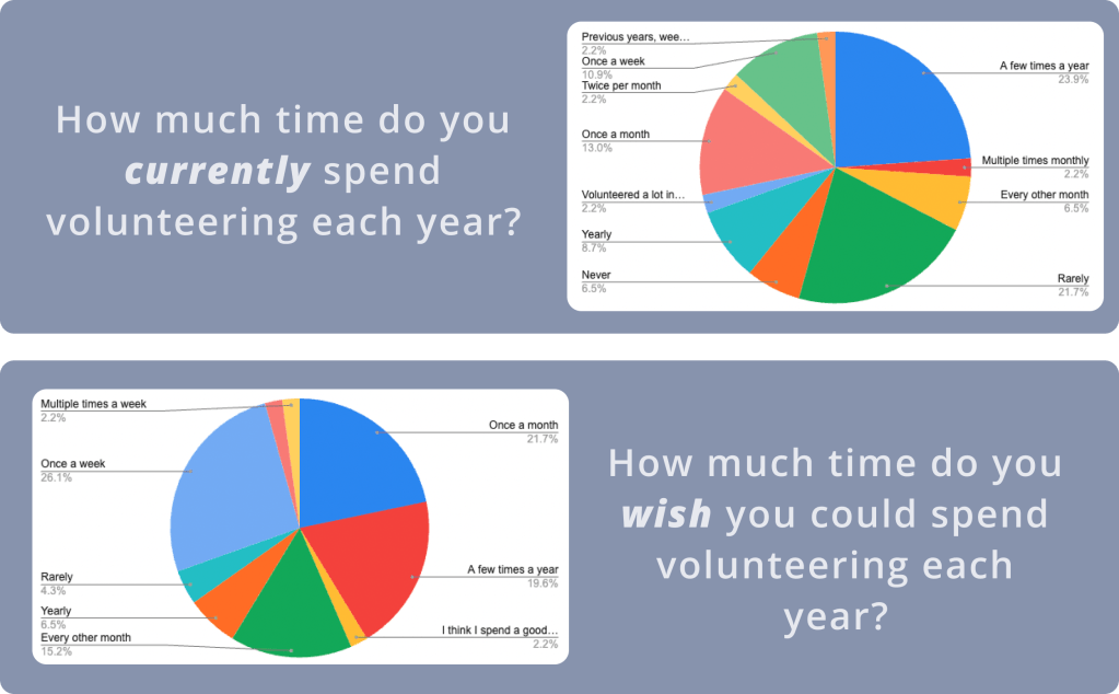
9/07-9/11 – 46 responses
71% of respondents said they want to volunteer more frequently than they do currently.
What words come to mind when you think of volunteering?
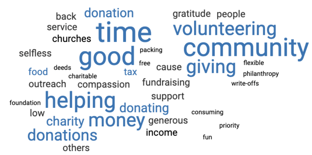
Main words coming to mind from our respondents were community, giving, helping, and donating.
What is most important for you when deciding whether or not to get involved with a non-profit organization?
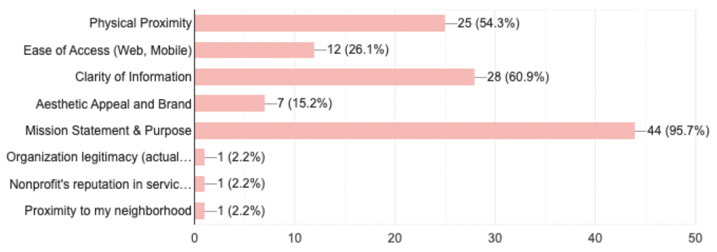
The most important things to our respondents were what the Non-Profit’s Mission and Purpose are and whether the Non-Profit was within a reasonable physical proximity to the potential volunteer.
DEFINE
Key User Insights & User Persona & Storyboard
After doing our user interviews and survey and after we analyzed our data in an affinity diagram, we came up with the following key user insights:
Reasons for Volunteering
“I prefer to volunteer rather than donate because I like to physically make a difference/change in my community”
Methods to Get Involved
“I find organizations through friends’ recommendations and don’t feel the need to research these much because of trust”
Constraints
“It’s hard to figure out where to start – there are so many good causes so it’s hard to pick one” & “The main constraint when it comes to volunteering for me is time”
Feels Good to Give Back
“I enjoy volunteering to give back to my community and meet new people”
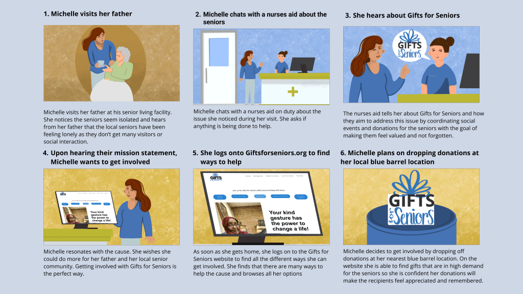
User Insight: Michelle needs to find easier ways to get involved with her community because she only gets involved with organizations that she can trust on a personal level.

Defining the Problem
Problem Statement:
We believe that clarifying the mission and defining the ways people can contribute to and partner with Gifts for Seniors will achieve more donations and involvement for the cause.
Value Proposition:
For Community Members who want to volunteer or give back, Gifts for Seniors is doing good work in the area of helping seniors feel more connected and taken care of by their community. Their mission to provide life-affirming personal contact to isolated seniors will resonate with many community members.
IDEATE
Original Website Usability Testing Plan
Goal/Objectives
We aim to understand any confusion our users may run into when trying to complete the tasks outlined in this test. We want to understand what is currently working with the gifts for seniors website and what is not working as well as what is working, but confusing.
Methodology
Five total usability tests on desktop will be conducted to gather qualitative data from users. Data will be gathered in figjam and then placed into a prioritization matrix to better visualize what iterations need to be made.
Tasks
- Find the Donation Page
- Find Agency Partner Information
- Learn How to Host a Gift Drive
- Find how to participate in Cards for Seniors

Feature Prioritization Matrix about the original website
From User Testing we developed the results into a feature prioritization matrix.
6 features stood out to us as top priorities to implement within the redesign
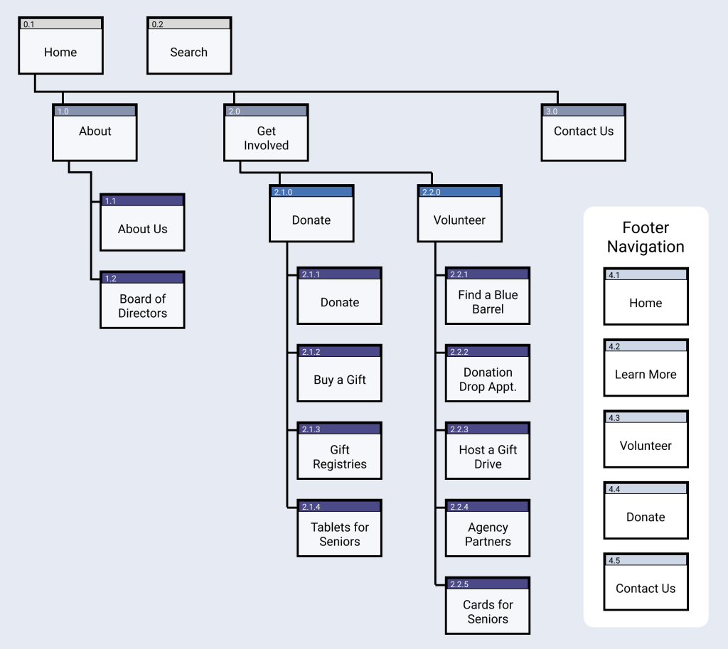
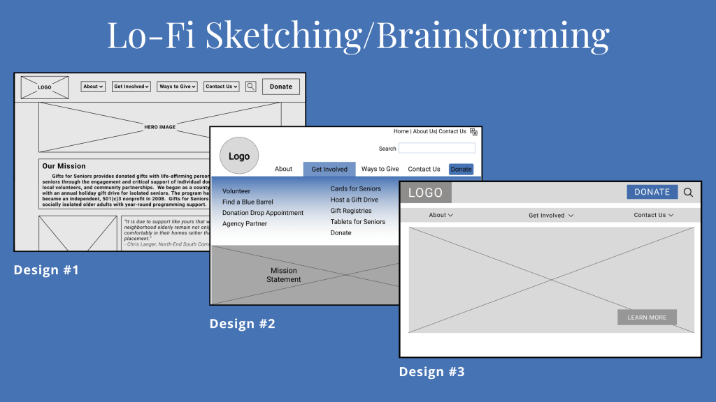
Site Map and Card Sorting Insights
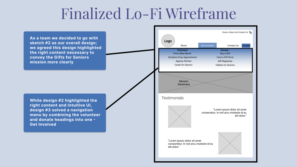
- The original site has many of the same things with different headings and in multiple different places. We consolidated these inconsistencies.
- Card sorting similar things was difficult, mainly things in the donate and volunteer categories. We grouped these under “Get Involved” to try to alleviate confusion around these things.
PROTOTYPE & TEST
Prototype Usability Testing Plan
Goal/Objectives
We aim to understand any confusion our users may run into when trying to complete the tasks outlined in this test in order to better understand how we can iterate our prototypes to be as seamless and intuitive as possible.
Methodology
Five total usability tests (three mobile and two desktop) will be conducted to gather qualitative data from users. Data will be gathered in figjam and then placed into a prioritization matrix to better visualize what iterations need to be made.
Tasks
- Go about making a monetary donation
- Become an Agency Partner
- Find how to participate in Cards for Seniors
Feature Prioritization Matrix
on the Prototype
7 features stood out to us as top priorities to implement as we move towards a hi-fi prototype:
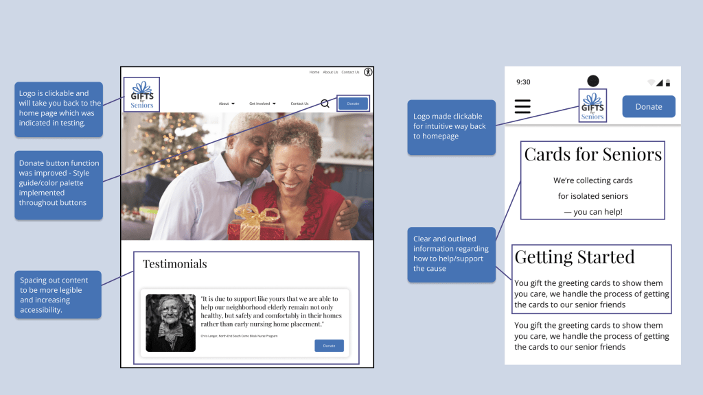
-Apply style guide
-Intuitive way back to homepage
-Hover states
-Adjust white space
-Consistent style to social icons
-Adjust spacing, sizing and alignment of the footer
Iterations
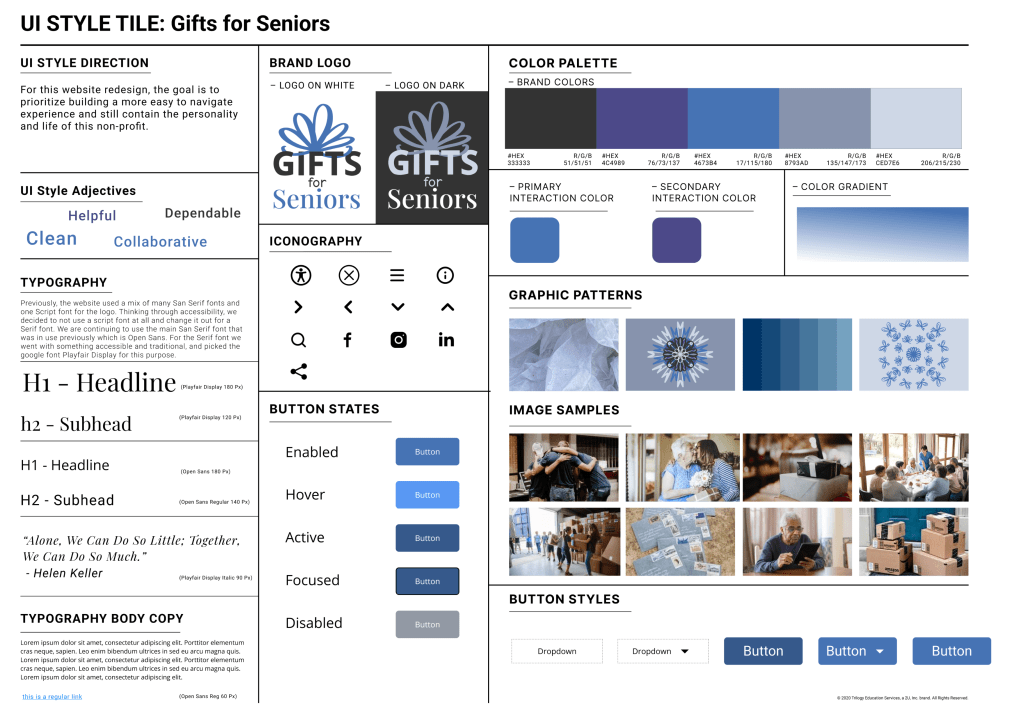
UI Style Guide
Clean
Dependable
Helpful
Collaborative
UI Style Direction
For this website redesign, the goal is to prioritize building a more easy to navigate experience and still contain the personality and life of this non-profit.
Colors
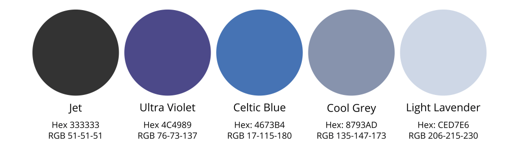
We took the original colors from the Gifts for Seniors website and added other colors that were complementary to the original blue and Jet grey.
Typography
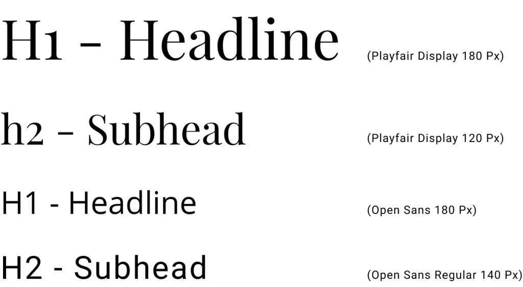
Previously, the website used a mix of many San Serif fonts and one Script font for the logo. Thinking through accessibility, we decided to not use a script font at all and change it out for a Serif font. We are continuing to use the main San Serif font that was in use previously which is Open Sans. For the Serif font we went with something accessible and traditional, and picked the google font Playfair Display for this purpose.
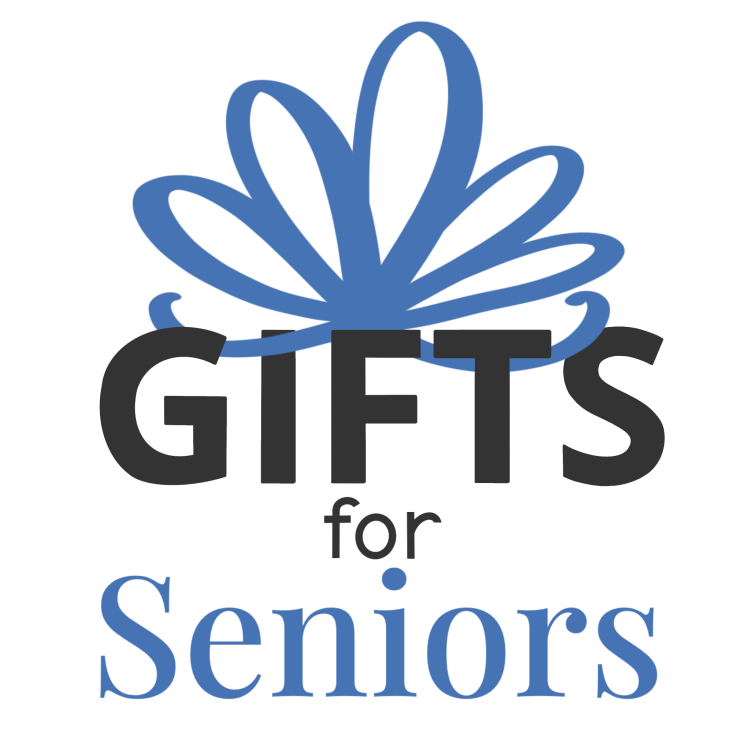
Original Logo versus New Design
The original Gifts for Seniors logo used a bold san-serif font and a script font. These two fonts were unbalanced, and with the bow made from many “O’s” that did not look like an actual bow, we decided to redo the logo for something more accessible and modern. We chose to use a more balanced san-serif with a serif font in a square shape to represent the present underneath a hand drawn bow illustration.
PROTOTYPES

Conclusion and Future Goals
Stakeholder Alignment
- Current Mission: alleviating social isolation for seniors, helping them remain connected to the community, and identifying financial exploitation, abuse, and self neglect
Showing more of the WHY on the website - Additional impactful offerings that are not currently on the website
- Balance between having relevant information on the website, and having too much detail to constantly have to update
Next Steps
QR Codes: allow users to instantly land on the donate page when scanning live donation sites
Volunteer: integrate scheduling system into website and lean into more ways that people can easily can involved directly
Increase Accessibility & Interaction: Add searchable zip codes and interacting Maps to easily locate where users can donate
Tools Used:
Figma, Canva, Google Drive, Slack, Figjam, Pinterest, Procreate
Non-Profit RWD
- Categorizing ways to get involved (Donate vs. Volunteer) lowers the barrier to entry for new users
- Connect with users on a personal, emotional level for them to gain trust in the organization
- Not all non-profits have the resources to take their websites to the next level – avoid scope creep and keep it feasible within the timeframe
UX/UI Designers:
Eliana Smelansky, Carolina Juarez, Gretchen Cerny, Ben Larson, Danielle Clifford
The Group
As a group, we were able to lean into individual strengths (Research & Analysis, Visual Design, Interaction, Prototyping) to divide and conquer while still coming together at key moments like User Insights, Wireframing, and Feature Prioritization. Communication was key as we kept in touch through daily standup, Slack, Zoom, and meeting To-Do deadlines to stay on track. We were able to work through roadblocks such as how to structure the Site Map using group discussion and successfully completed two functioning prototypes for Gifts for Seniors.
Resources
Unsplash Images for the Moodboard and Prototype
Pinterest for the Moodboard
Main Figma File: Prototyping (all phases), User Research, Style Guide, Components
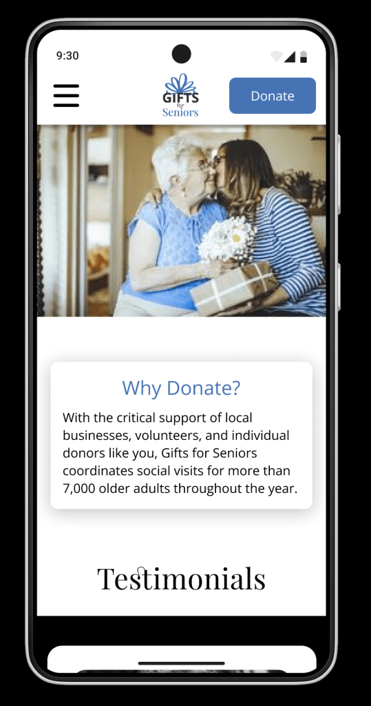
Final Desktop Flow
Final Mobile Flow
Fig Jam – User Insights, Brainstorming, Card Sorting
Additional Informational Slides to follow.
Contact Me
Danielle Clifford
danielleeclifford@gmail.com
612-599-2319
